Fixed Prosthetic Lab | LeBeau Dental Lab
  • Home
  • About Us
    • Team
    • Current Escapades
    • Lab Tour
    • Publications
    • Testimonials
  • Services
    • Zirconia
    • E-Max
    • JKAD
    • Implants >
      • Screw Retained
    • Diagnostics/Provisionals
    • Metal Ceramics
  • Doc-Lab Communication
    • Prescription Form
    • Case Pre-Scheduling
    • Shade-Taking / Patient Photography
    • Photography Tips
    • Shipping Procedures
  • Courses
  • Client Showcase
    • Client Showcase Video
    • Client Showcase Photos
    • Case of the Quarter
  • Blog
  • Contact Us

DENTAL STREET BLOG

Shade Communication - Part 2: Photography

12/19/2012

0 Comments


Shade Communication - Part 2: Photography

Not that long ago dentists simply wrote the shade on the prescription and asked that the restoration match it exactly or they gave a written description of how to change it. Never mind that the same tab is likely a little different on each version or that verbally describing color is ridiculous at best. Imagine instructions like, “add more translucency” and pretend that we all have the same measurement of more, a little more, or a lot more.

Most top ceramists generally agree on what is important in photography, while lamenting that they don’t receive it often enough. Most of you are familiar with our head ceramist Gary Nunokawa through his work at the Kois Center and other educational venues. I want to use this opportunity to give you insight on what an accomplished ceramist wants in photography and what Gary sees in the different photographs.

Dene LeBeau


Photography, Color and What Matters by Gary Nunokawa 

Picture
I have been working in dental ceramics for over thirty years and have witnessed a great deal of change in ceramic and core material choice, while observing little if any change in how color is seen and communicated. I will intentionally avoid dentin color effects on all ceramic restorations, and will tackle that issue in a future discussion.

Hue, value and chroma are the bedrock principles of color. Let’s begin with a simple explanation. Hue is the basic color, value is the brightness, and chroma is the amount of saturation.

In terms of importance, I would categorize these items as:

  1. Value
  2. Chroma
  3. Hue
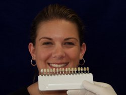
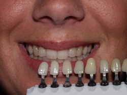
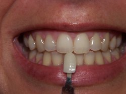
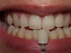
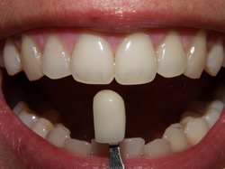
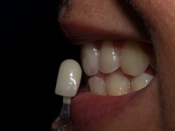
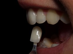
The reason I placed value as the most important is because it is the most common reason that patients reject a restoration. All of us will see the crown as too dark or light before we can even consider the nuance of color. Teeth can and do harmonize next to each other with different color, but when it is too dark or light the difference becomes much like a head light. If the value is correct and the color is close, patients will usually embrace the esthetics. Control of the value is most important. The following seven photographs are the angles, distance and exposures we ask our clients to provide us for their anterior cases. In each photograph, I will explain why I want that particular shot, and what I see that may influence my ceramic decision making. ALWAYS place a shade tab for color/value contrast in each photo. From contour and morphology, to color and function, these photographs will typically provide me with information that I need to be successful with a case.

Some bullet points to consider for ALL photographs are:

  • The patient’s head must be level to the earth.
  • Teeth must be completely hydrated before photos are taken.
  • All lipstick must be removed.
  • A neutral light blue or beige bib only.
  • Remove necks from all shade tabs and arrange them into the guide in value order from left to right, light to dark. B-1 A-1 B-2 D2 A-2 C-1 D-3 A-3 D-4 C-2 B-3 B-4 A-3.5 C-3 C-4

Picture
Photo 1: A full face photo is necessary and can be the distance of this photo or as close as the hairline, to the bottom of the chin (speaking distance). The value arranged shade guide is randomly placed near the middle of the cartridge, and the patient’s head is ALWAYS level to the earth. This is the first opportunity for the clinician and me to get an idea of the value (light and dark) of the teeth. Restricting the amount of light entering your eyes will aid you in seeing value, so ALWAYS squint your eyes when choosing value shades. Start the value process as described in this photo, be quick in making value decisions, and believe in your instincts. 
With the values arranged from light to dark, you can quickly get into the desired value range. Because I trust that the clinician took this photo with the patient perfectly horizontal, I can visually verify the position of the maxillary and make certain that the mounted casts are the same. Any noticeable horizontal difference between the mounted cast and this photo would bring into question the accuracy of the facebow. 

Picture
Picture
Picture
Photo 2: Image is chin to nose-cheek to cheek with the patient’s head level to the earth. With this photo, you have narrowed your value choice down to a select few shade tabs based on what you saw on the first photo. This photo allows me to make a closer determination of the base value by contrasting the three closest value guides at a closer range. This image is also my first opportunity to see papilla and scalloping contours that may need to be referenced again when contouring the final restorations. 
Photo 3: Now zoom in for a 6-11 full mouth shot showing gingival architecture. Place the shade tab with closest value shade in picture. (If you are still not certain that one value shade fits what you see, use 3 tabs to bracket the shade, 1 shade lighter, and 1 shade darker). Value is more accurate than color in photography, so it is incumbent on the ceramist to make value shifts in a restoration when dependable photography is available. NOTE: This is an older image and today I prefer that the shade tab be placed by #7 or #10 to allow myself a better view of the upper and lower midline together.
Photo 4: Zoom in to a tight #6-11 shot with an edge to edge position of the teeth. This photo gives the teeth a darker background which helps me see deeper into the teeth for different values, depths and chroma shifts. This image gives me information for internal characterization, value control, and how the anterior teeth actually come together at the edge to edge position. I must give extra consideration to this photo if these tooth positions cannot be recreated with the casts in protrusive on the articulator. Place the shade tab with the closest value in the picture and this may be a good spot to place a chroma guide if needed. ALWAYS write the chroma and value shades on the prescription. It is not possible to display the shade tab I.D. in every photo. 
Picture
Picture
Picture

Photo 5: This will be at a similar distance as Photo 4 but with an open position. Again the darker background helps reinforce the control of value, and the Incisal skyline can be seen better without the distraction of the opposing teeth. Place the shade tab with the closest value in the picture and add chroma tab if desired. 
Photo 6: This profile photo provides us with shade information for the inter-proximal/embrasure areas and offers insight on surface texture and luster. Sometimes a tooth may display a high chroma spot on its facial only to disappear in the profile photo. This phenomenon may suggest that this chroma spot is buried deep within the tooth structure and the ceramic layering should be deep as well. 
Photo 7: This is the same profile angle as Photo 6 but with the mouth open. Open mouth provides a dark back backdrop for a better view of the incisal edges. The shade guide can be placed perpendicular to the incisal edge. The upper lip was a little low on this photo.


In summary, I would probably rewrite the text on each of these photographs with the circumstances presented with each new patient. My point is, these seven photographs will typically provide me with the information that I need and will minimize confusion. Sometimes a ceramist may receive twenty, thirty or even forty photographs with variable camera settings and flash for one case. It is obvious that a clinician who does that much work cares deeply about the final results; however, an information overload can often be the enemy to esthetics. I respect the opinions of all of my peers and recognize that they may want photography that is different from mine. I welcome other opinions and encourage comments on this blog.

– Gary
0 Comments

Your comment will be posted after it is approved.


Leave a Reply.

    Dental Street Blog

    Categories

    All
    A Book That Matters
    Abutment Seating Jigs
    Case Of The Quarter 11/15
    Case Of The Quarter 16'
    Case Of The Quarter 8/15
    Crown Seat Times
    Dr. Gary Hopper
    EAO: Treating Small Esthethic Issues
    Emax Or Zirconia
    Gold Standard For Impressions
    Lighter Shades Of Dentistry
    Mindful Aesthetics
    Renaissance Of Dental Technology
    Seating Crowns
    Seating Custom Abutments: JKAD
    Shade Communication
    Shade Communication Photography
    The PPO: All You Need To Know
    Zirconia: In Whole Cloth
    Zirconia: Is It Finally Here?

    Archives

    March 2022
    February 2021
    January 2020
    May 2019
    March 2019
    February 2019
    January 2018
    May 2017
    May 2016
    January 2016
    November 2015
    August 2015
    February 2015
    March 2014
    September 2013
    June 2013
    May 2013
    March 2013
    January 2013
    December 2012
    October 2012
    June 2012
    April 2012

    RSS Feed

    View my profile on LinkedIn

Hours

M-TH: 8am - 5pm
​PST
​

Telephone

425-251-3535

Email

info@lebeaudental.com
Copyright © 2011 LeBeau all rights reserved          Website created by: Cuddy Connections LLC. 

  • Home
  • About Us
    • Team
    • Current Escapades
    • Lab Tour
    • Publications
    • Testimonials
  • Services
    • Zirconia
    • E-Max
    • JKAD
    • Implants >
      • Screw Retained
    • Diagnostics/Provisionals
    • Metal Ceramics
  • Doc-Lab Communication
    • Prescription Form
    • Case Pre-Scheduling
    • Shade-Taking / Patient Photography
    • Photography Tips
    • Shipping Procedures
  • Courses
  • Client Showcase
    • Client Showcase Video
    • Client Showcase Photos
    • Case of the Quarter
  • Blog
  • Contact Us